National Council of Nonprofits Adds Multiple Signs to Office
In today’s world everyone needs to pay attention to branding and how their brand is presented to the world. Not just celebrities and businesses either; if you’re in the public eye, you have to take care on how you’re seen. Everything about what you show to your community and the world at large must be carefully crafted.
This includes nonprofits as well. Arguably they are in the public eye even more than most businesses considering they are serving public interests. No matter the cause, they’re out there mixing it up with people they want to assist. If anything about their branding is “off” it could go against their whole message. This could hurt the very people they want to assist.
The National Council of Nonprofits provides resources for other nonprofits all over the country. One of the biggest problems with running a nonprofit is resources – where do they come from? How do you organize everyone with so little money and help? How do you even get started? Wanting to help is one thing, but actually getting it done is another.
That’s where the Council comes in. They help leaders all over figure out how to best run their organizations in the face of so much adversity. They also showcase trends, practices, and other tips that help organizations succeed.
As a result of this great work, the Council knows they needed some solid signage. Something simple but effective that would accentuate their low-key office but would also play up what they’re all about.
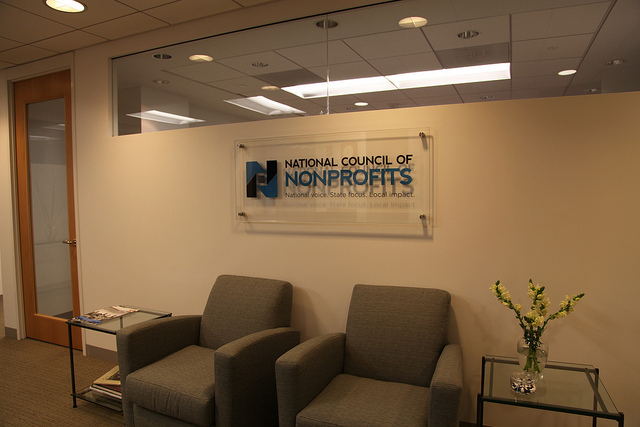
Here’s the first sign:

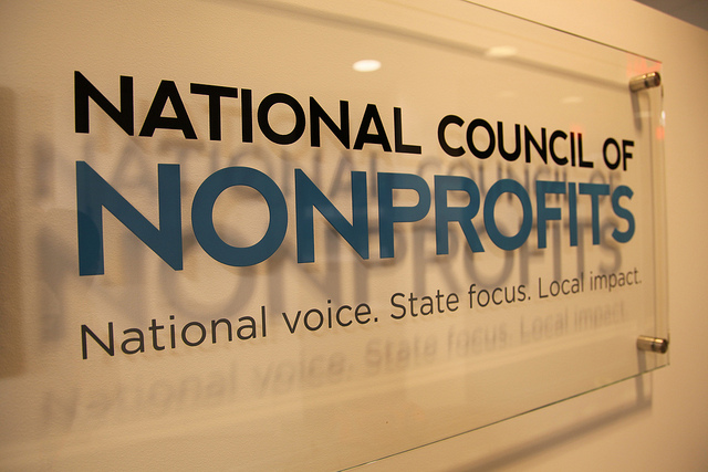
As you can see, it’s in their lobby, giving the entrance to the Council a professional feel. The clear etched glass sign with paint filled custom colors and brushed aluminum stand offs helps make the logo and lettering pop. Speaking of the logo, look at this close-up:

When you put the pieces together, it’s pretty genius. The square in the middle is being boosted by the other pieces of the logo, including giving it space to breathe on its own. It goes along with the branding and feel of the Council – to give others the help they need to operate on their own.
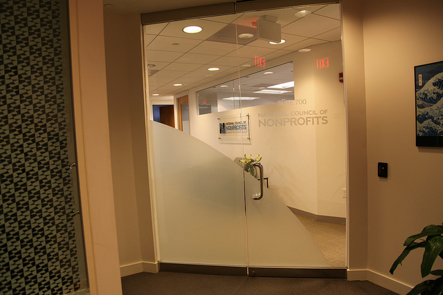
But that’s not the end. We also made an etched glass vinyl decal film for the outside door of the office. While not quite as eye-popping and noteworthy as the signage inside, it does its job. The purpose is to inform those walking in the building to locate the office of the National Council of Nonprofits, and this sign does so with gusto.

However you should also notice the large swoosh that takes up a large part of the door. You can see the image it gives someone walking up to the door. The Council knows how important a first impression is and went out of their way to make sure visitors see what they want them to see. Take special notice that part of that “first impression” is our clear glass sign!
We’re honored we get to work with an organization like the National Council of Nonprofits and help them with their branding and signs. We wish them luck with all their endeavors and all the great nonprofits helping so many people out there!
Written by Shabbir Moosabhoy