A Case Study of the Ryan Specialty Group Relocation
Relocating is always an exciting time. Even if you completely adored the old location, there’s just something about coming out with a brand new face of a company that’s exhilarating. It’s a time for new beginnings, new paths, and possibly new customers and clients.
Recently, Ryan Specialty Group, a Chicago based organization devoted exclusively to creating sophisticated insurance and risk management solutions, was moving offices to a much bigger space. They had outgrown their old space and wanted a bigger corporate office to fill up. What better time, then, for new signage as well?
Impact Signs and our designer, Jesus Perez. were excited to be an integral part of this relocation.
Of course one of the most important aspects for a relocation as far as we’re concerned is the signage. It’s what most customers see before they ever walk into your place of business. Plus, there’s nothing like a big change in the signs employees see every day to spark new pride in their workplace.
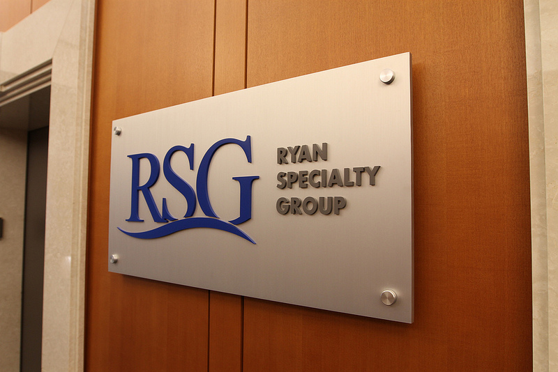
Ryan Specialty Group knew this and wanted to create a brand new feel to go along with their new office. First, they wanted to show clients what to expect before they ever entered the office:
This immediately sets the tone for the client’s visit. This finely detailed brushed aluminum panel sign shows the professionalism they can expect. The logo easily stands out with its rich dark blue hue with the subtle letters of the full name popping out so it’s easy to read.
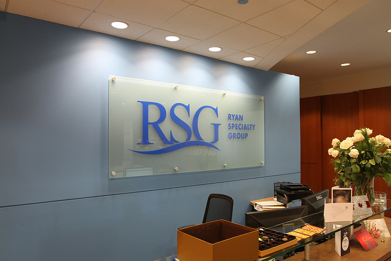
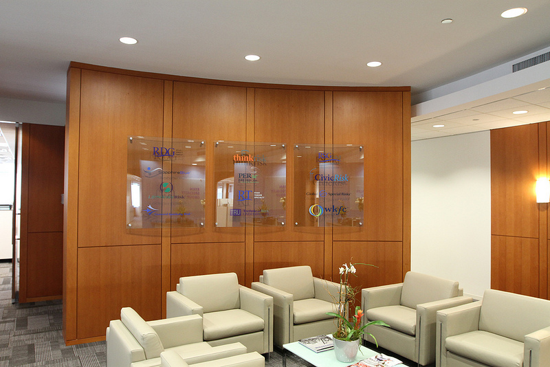
Inside the story gets even more exciting. After they enter the office, the client is greeted with a large 4X8 foot glass panel lobby sign featuring the same sharp logo from the elevator sign. Also in the lobby are two glass panels showing off the various affiliates and companies of RSG, including Sapphire Blue, Concord Specialty Risk, and CivicRisk.
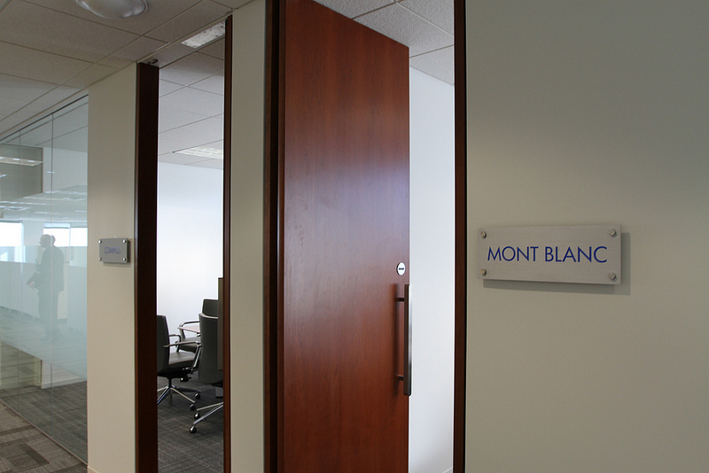
RSG could’ve stopped there with these signs just in order to get clients in the door and on the books. However, they know a complete relocation has to go above and beyond to be effective. That’s why when clients walk to the back for meetings and discussions they are greeted by even more new signs demonstrating the true professionalism they can expect when working with the organization.
These signs have the same dark blue as the other signs. The room ID signs feature brushed aluminum and stand-offs with a simple font to denote direction rather than flash.
Here’s what Chelsey Krull of Ryan Specialty Group had to say about Impact Signs’ work on the signage:
Ryan Specialty Group has worked with Impact Signs for over 3 years, and we couldn’t be happier with their continued service and superior signage. In fact, we were so pleased with their sign quality, we used them again for our new office location. Not to mention they are our ‘go to’ sign company for RSG office locations throughout the country. Despite asking Impact and their team to coordinate projects that cross time zones and require several contacts, we have never been disappointed with the finished result. Thank you! – Ryan Specialty Group
We’re very proud of the work we’ve done with RSG to help them pull off such an elegant relocation. We wish them great success with the new signs.
Written by Shabbir Moosabhoy
Ryan Specialty Group, a set on Flickr.


