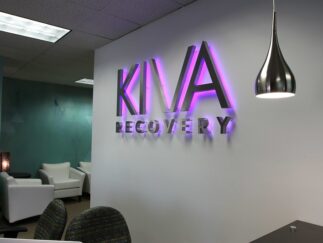
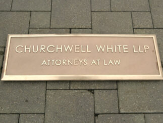
Your exterior sign is often what customers see first, and if it is well designed, it can catch people’s attention and draw them in.
Today, there are lots of options for creating impressive restaurant signs. High-quality materials and modern technologies like backlit letters and LED displays can make your signage more impactful.
In this guide, we’ll explore the best practices for creating restaurant signage that not only looks great but also helps grow your business.
Types of restaurant signage and their importance
Restaurants use many different kinds of signs. Some signs catch people’s attention from far away, while others give important information once customers are inside. Let’s look at the main types of restaurant signs and explain why each one matters.
Exterior signs for restaurants
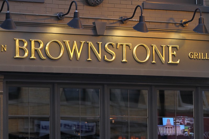
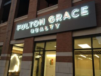
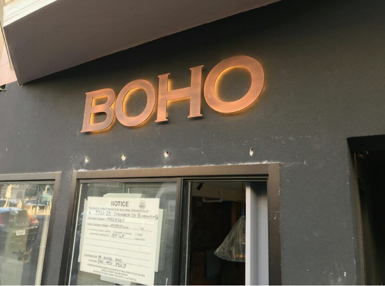
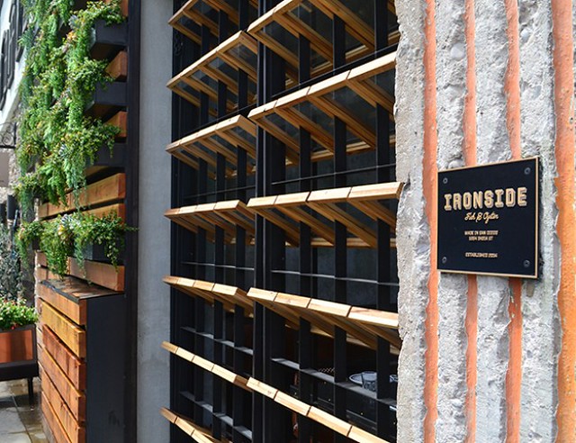
- Building signs are large exterior signs that show your restaurant’s name and logo on the outside of your building. They help people see and remember your restaurant. You can choose from options like aluminum panels or backlit letters that light up at night.
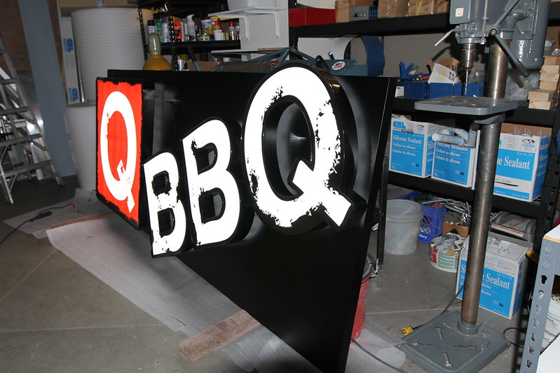
- Window graphics are designs or promotional messages on your restaurant’s windows. They catch people’s eye and can tell them about special offers or events you’re having.
- A-frame signs are portable signs you can put on the sidewalk. They’re great for attracting people walking by. You can easily change the message on these signs whenever you want.
Interior signs
- Interior name signs are like the building signs, but inside your restaurant. They show your name and logo to remind customers of your brand.
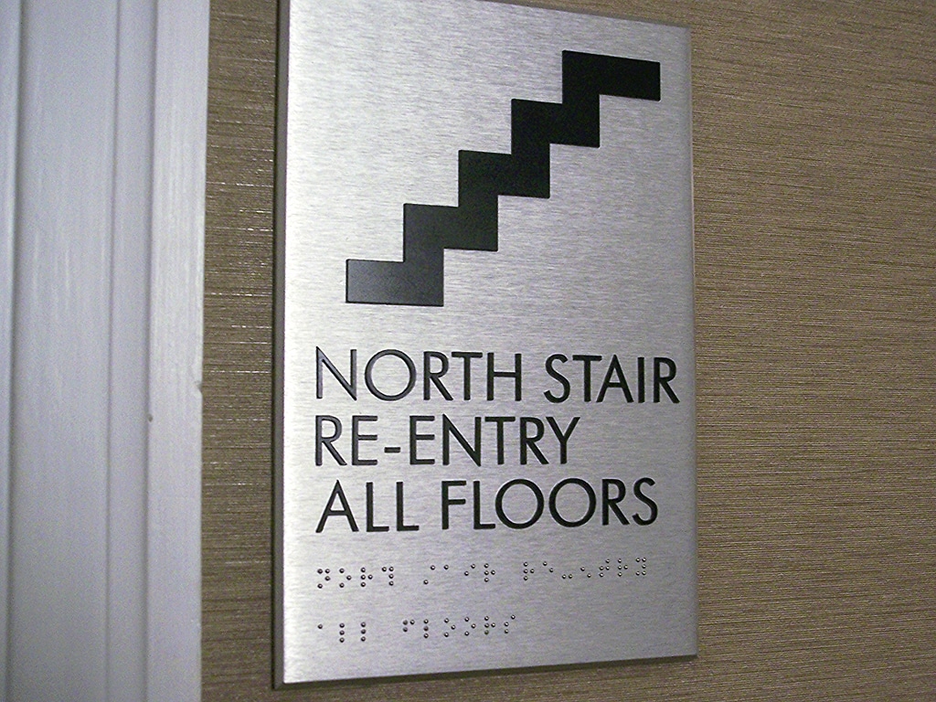
- Directional signs help customers find their way around your restaurant. They might point to restrooms or different seating areas. It’s important to make these signs clear and easy to understand.
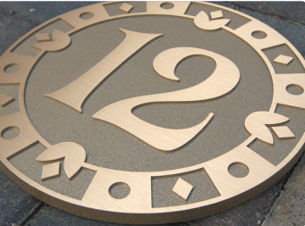
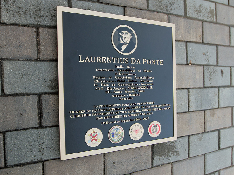
- Decorative signs add to the look and feel of your restaurant. They can be wall art, neon signs, or custom plaques that match your restaurant’s theme.
- Menu boards show your food and drink options. They can be digital screens or regular boards. Make sure they’re clear and legible and put them where customers can see them easily.
Design tips for impactful restaurant signage
Here are some practical tips to help you create signs that grab attention and effectively communicate your brand.
1. Define your audience
Knowing who your customers are is a great way to create effective signage. Start by clearly identifying your main customer groups. Are they families, young professionals, or tourists? Once you know this, you can design signs that speak directly to them.
Research what your target audience likes in terms of colors, styles, and messages. This information will help you create signs that catch their eye and make them want to visit your restaurant.
Use words and images that your audience connects with. For example, if you run a family-friendly restaurant, you might use warm, inviting colors and playful fonts, which can help create a welcoming feeling that appeals to families.
2. Ensure clarity and readability
Your signs need to be easy to read and understand. To make sure your message comes across clearly:
- Choose clear fonts: Pick fonts that are easy to read from far away.
- Keep it short and simple: Use brief messages to avoid cluttering your sign. Focus on the most important information, like your restaurant’s name, logo, and a short, catchy phrase.
- Make it big enough: Make sure your graphics and text are large enough to read from where people will see them. Leave enough space between letters and lines to prevent crowding and improve clarity.
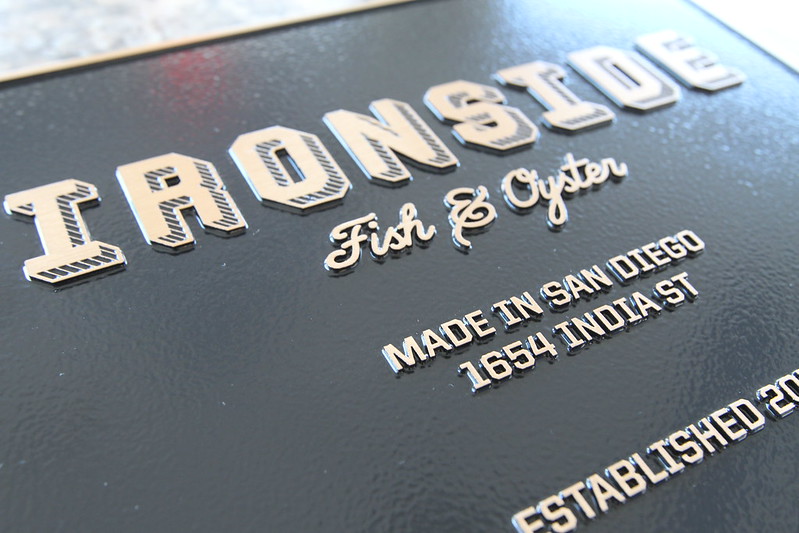
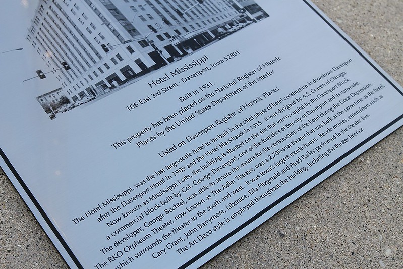
- Choose durable materials: Materials like stainless steel or corten steel keep your signs looking good and readable for a long time. For example, stainless steel plaques from Impact Signs offer clear, precise text and images that are easy to read. These plaques are great for creating signs that last and stay readable in all weather conditions.
3. Use effective color contrast
Colors can do more than help your signs stand out. According to a study by Review42, color influences 85% of buyers’ decisions. In fact, color psychology shows that some colors are proven to stimulate people’s appetite and increase their excitement. With so much at stake, here’s how you can use colors well in your restaurant signage:
- Choose colors that work well together: Pick colors that make your text and images pop. For example, dark text on a light background or light text on a dark background is easy to read.
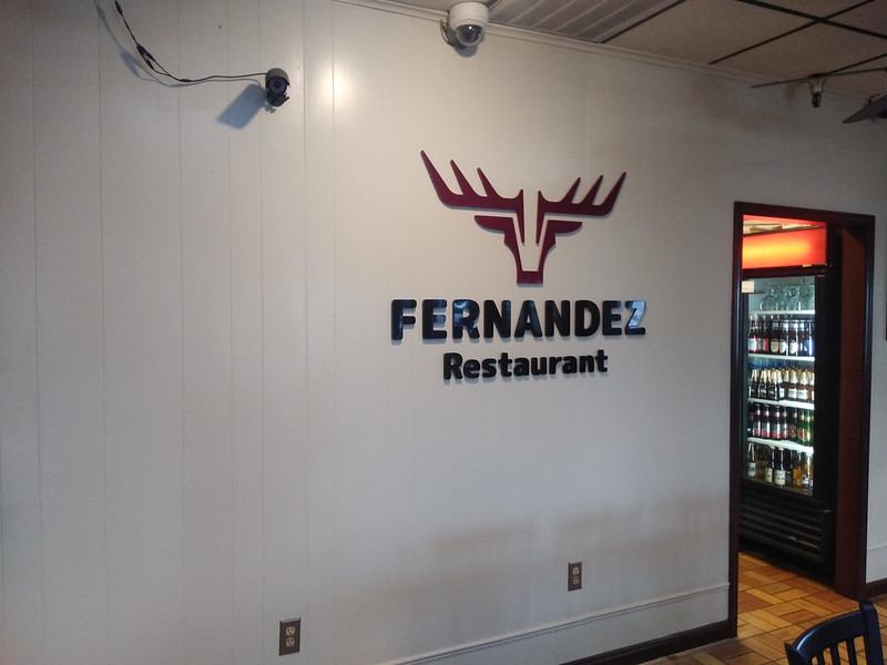
- Use your brand colors: Include your restaurant’s colors in your signs, but make sure they’re easy to read. If your brand colors don’t contrast well, add a third color that makes the text stand out.
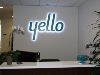
- Think about lighting: Consider how your signs will look in a different light. Backlit signs can be great for nighttime visibility. At Impact Signs, we offer halo-lit signs that create a glowing effect around the letters, making them easy to see at night.
- Try LED signs: LED signs are bright and can change colors. These exterior lighted signs look great both day and night and can really catch people’s eye.
4. Choose the right fonts
Here’s an interesting fact – researchers in the UK found that diners perceived a Chinese restaurant as more authentic when its outdoor signage used traditional vertical Chinese characters, compared to a computer-generated calligraphic font.
What does this mean for you?
Font choice is a powerful tool for shaping perceptions and creating effective signage in the restaurant industry. Fonts work together with colors, materials and copy to convey the right personality and message to potential diners. Here are some tips to help you decide:
- Use clear, simple fonts: Sans-serif fonts like Verdana, Arial, and Tahoma are great choices. They’re easy to read from far away because they don’t have extra decorations on the letters.
- Make it bold: Use bold or semi-bold fonts to make your text stand out. This helps people read your signs even when they’re not up close.
- Mix and match: You can use different fonts together to make your signs look interesting. For example, you might use one font for big headings and another for smaller text. Just make sure they look good together.
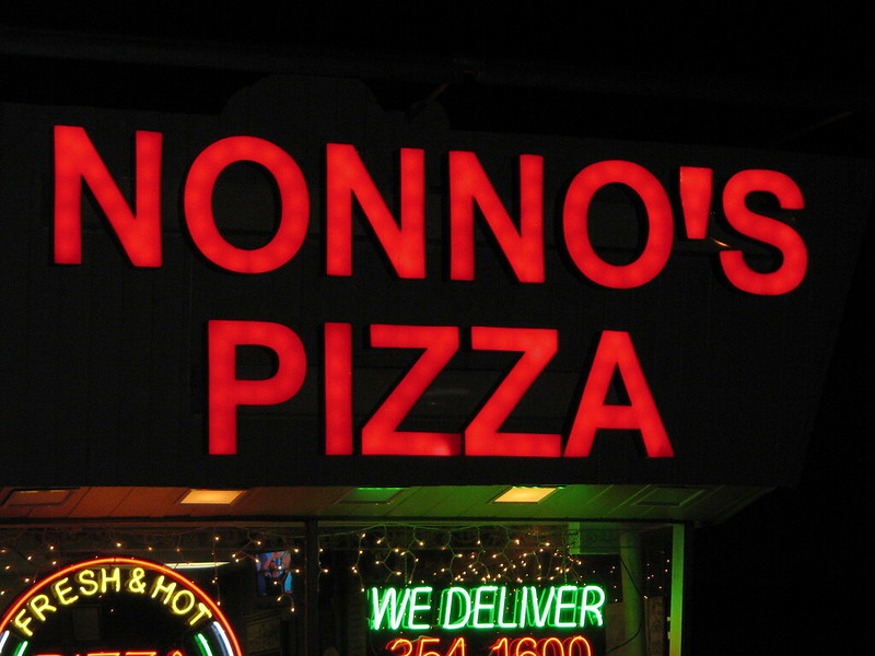
- Stay consistent: Use the same fonts on all your signs. This helps people recognize your restaurant more easily.
- Test it out: Before you finalize your sign design, check how it looks from far away and in different lighting. This helps ensure your signs are easy to read in all conditions.
5. Incorporate logos thoughtfully
Did you know? The American Shopper Study found that nearly 36% of diners were attracted to an unfamiliar restaurant because it had a high-quality outdoor logo sign. Your logo is a key part of your restaurant’s identity. Here’s how to use it well in your signs:
- Size and placement matter: Make sure your logo doesn’t take over the whole sign. It should be easy to see but not bigger than the main message. Try putting it in the top or bottom corners of your sign.
- Match colors: Your logo colors should go well with the rest of your sign. This helps everything look good together.
- Use quality materials: Using materials like cast bronze or metal for your logo can make it stand out. At Impact Signs, we offer stainless steel and aluminum plaques that can make your logo look great and last a long time.
- Balance with text: Make sure your logo fits well with any words on your sign. It should be the right size and lined up nicely to create a balanced look.
6. Leverage negative space
Negative space is the empty area around your sign’s elements that ensures clarity, readability, and helps people focus on the main message. As a result, you can use negative space to balance the words and pictures on your sign. This helps create a clear message that’s easy to understand.
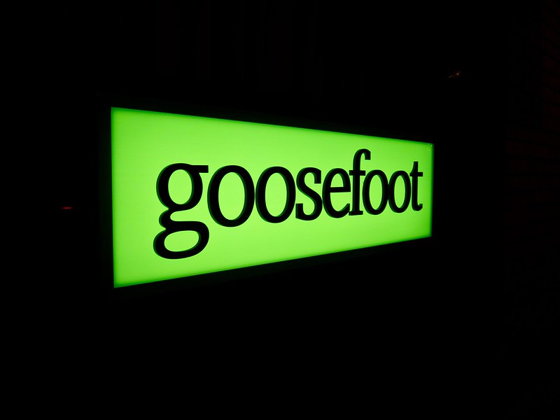
Tips for using negative space:
- Use clear fonts and leave enough space between lines of text.
- Place your logo and other images carefully to guide people’s eyes to the important parts.
- Don’t put too much information on one sign. Keep it simple.
- Make sure your sign is easy to understand from far away.
At Impact Signs, we offer products like backlit letters and dimensional sign letters that use negative space well. These can help make your signs look clean and eye-catching.

7. Check legal compliance
Following the law is important, particularly when creating your restaurant signs. Here’s what you need to know:
- Local rules: Every area has its own rules about signs. These rules might say how big your sign can be, where you can put it, and if it can light up. Make sure you know these rules before making your signs.
- Accessibility: Your signs should be easy for everyone to read, including people with disabilities. The Americans with Disabilities Act (ADA) has rules about this. Some important things to remember are:
- Use big enough letters.
- Make sure colors stand out from each other.
- Use Braille or raised letters when needed.
Tips to follow the rules:
- Talk to local officials or sign experts to understand the rules.
- Check your signs regularly to make sure they still follow the rules.
- Stay up to date with any new rules that might affect your signs.
8. Maintain consistency in design for better branding
When you use the same colors, fonts, and logos on all your signs, people start to recognize your restaurant more easily. This helps build trust with your customers.
Keeping your design the same across all your signs helps make your restaurant more memorable. This can help bring in more customers and make your business more successful.
Best materials for restaurant signage
Choosing the right materials for your restaurant signs is crucial. Good materials help your signs last longer and look great, even in tough weather. Let’s look at some of the best options and their strengths.
Advantages of stainless steel:
- Great for small, detailed letters and text.
- Doesn’t rust, so it’s good for both indoor and outdoor signs.
- Looks good for a long time.
Advantages of aluminum:
- Light and easy to work with.
- Versatile, works well for larger signs.
- Perfect for big outdoor letters, like your restaurant’s address.
- Comes in different finishes, like brushed or shiny.
Advantages of corten steel:
- Has a unique, rusty look that many people like.
- Very strong and lasts a long time.
- Great for making your restaurant stand out.
Advantages of cast bronze:
- Looks classic and fancy.
- Offers a timeless elegance that’s perfect for upscale establishments.
- Very durable and long-lasting.
- Good for special plaques or high-end signs.
When choosing a material, think about where your sign will be and what kind of look you want for your restaurant. For example, if your sign will be outside facing harsh weather, stainless steel or aluminum might be good choices. If you want a more rustic look, corten steel could be perfect.
At Impact Signs, we offer all these materials and can help you choose the best one for your needs. We can create custom signs that not only look great but also last for years, helping your restaurant stand out and attract customers!
Design creative restaurant signage solutions with Impact Signs
Creating great restaurant signs is all about choosing the right materials and designs. At Impact Signs, we understand that every restaurant is unique and needs signs that match its style and goals.
We offer a wide range of high-quality materials and technologies to make your signs stand out. Our team of experts will work with you to design signs that not only look amazing but also last for years.
Ready to create amazing signs for your restaurant? Contact Impact Signs today. Let’s work together to create signs that will impress your customers and help your business grow!

